
How I finally launched my fine art print shop
From decision paralysis to signed prints: how I chose limited edition, found a local printer, tested paper stocks and launched on Squarespace with zero prior experience.
If you've been thinking about launching a print shop but keep getting stuck in the process… I got you.
It took me years to actually launch this thing. Not years of working on it… moreso years of sitting on the idea, bumping into decisions I didn't have the answers to, and getting scared. I’d try approaching it again a few months later only to find another factor that made me question myself. Classic perfectionism and decision paralysis. There's no single right way to design a print shop, and somehow that made every option feel equally daunting. I was perpetually caught in "yes, prints are coming soon!" mode, and I think anyone who's been wanting to start something creative but can't get their head around the how will know exactly what I mean.
This past November, I set an end-of-year deadline with a group I share goals with. I said "I'm launching my print shop in December," and that accountability, saying it out loud to people I respect, is genuinely what made it happen. Since I launched, so many of you have asked how I went about it, so let’s we’ll through the full breakdown:
Why I chose limited edition fine art prints over open edition or print-on-demand
How I found a local printer I actually trust
Choosing the right paper (and why you should never skip test prints)
How a community vote shaped the final collection
Sizing, pricing, and why I don't offer framing
Building the site and launching on Squarespace
What it actually felt like to hold the finished prints
PS. I also shared these as reels for a shorter-form visual recap:
Limited edition vs. open edition
The first actual decision was format. There are generally two approaches: you can go with print-on-demand through an outsourced printing and shipping service (who take a fee on top of the printing cost and handle the fulfilment), or you can do limited edition fine art prints and handle things more directly.
Print-on-demand can be super convenient if you're selling high volume and there's absolutely nothing wrong with that. I've spoken to friends who use online click-and-ship services for standard, open edition prints and there are several really solid options out there. If higher-volume, hands-off printing suits your goals, it could be a great fit.
But for me and the works I wanted to offer, I wanted something much more personal. I wanted to be able to see, feel and hold every piece before it went to the person who bought it. I'm slightly neurotic like that (the scientist in me), and I wanted to make sure the quality was there at every single step. Limited edition meant less volume over time, but it also meant I could quality check, sign, and ship every piece myself. From a values standpoint, that sat much closer to heart.
Quality and control
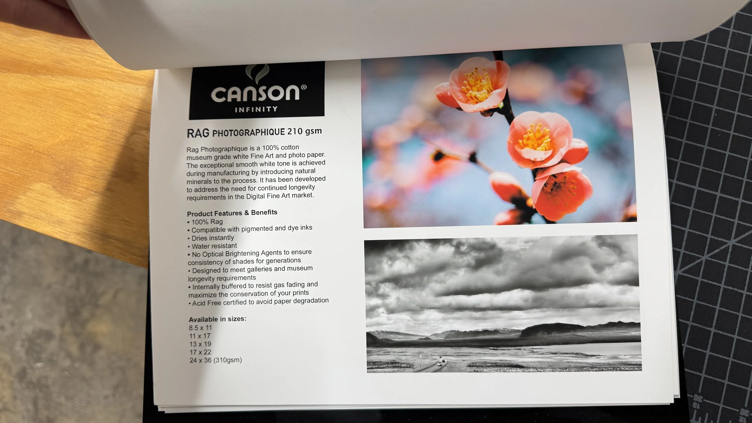
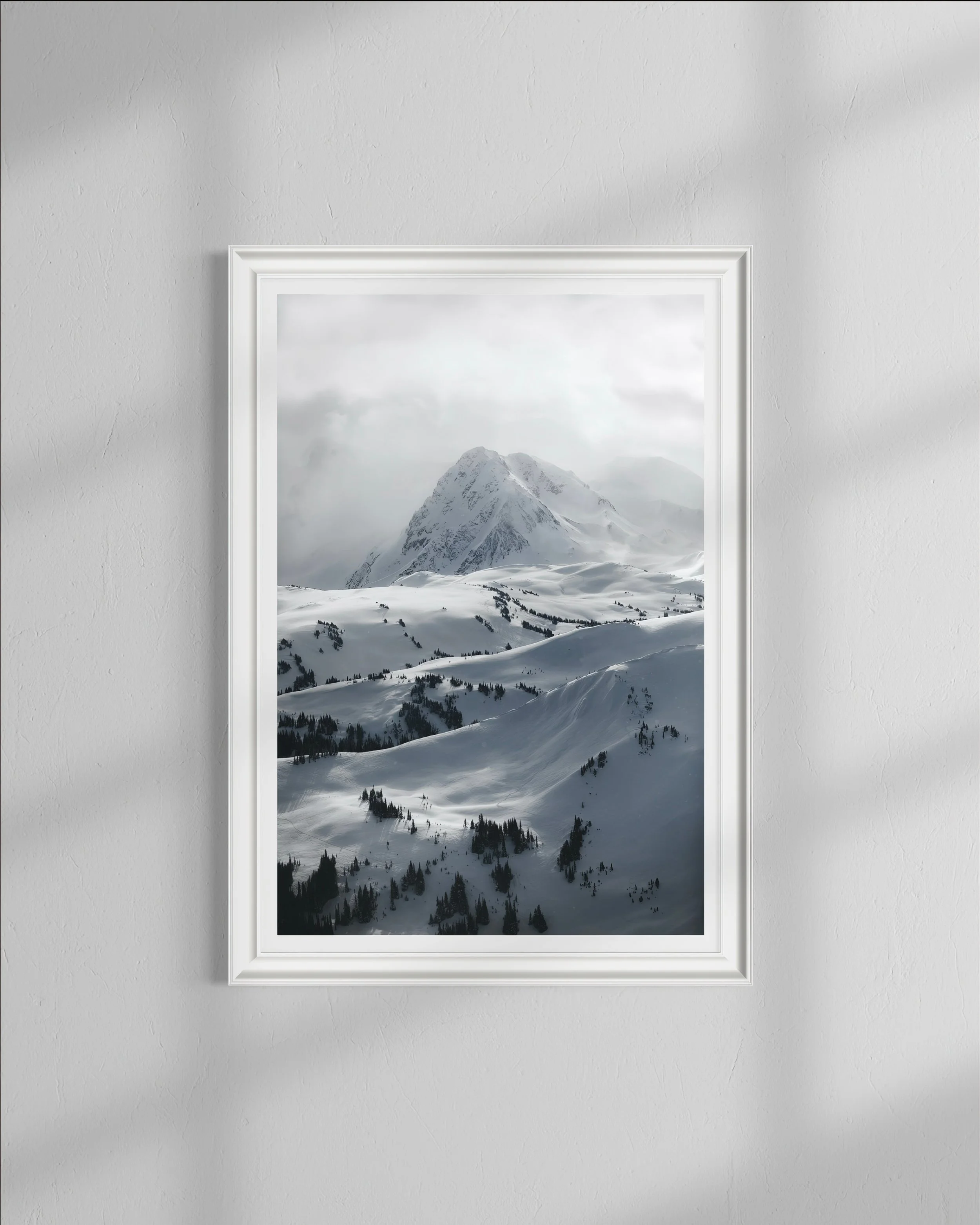
Paper quality? This was the easiest call for me. I wanted these prints to last on collector’s walls potentially for the rest of their lives. That meant museum-grade fine art paper, no shortcuts on that one. The quality of the paper had to match the quality of the work, full stop. We’ll get to the specifics of how I chose a paper further down.
How hands-on? Personally, I wanted to see every single print before it went out. I was going to sign and number each one anyway so that give me the opportunity to check that everything was right. I’d obviously be working with a printed that I trusted, but still things can shift with files, calibration or even the slightest colour banding error. So for me this was going to be fully involved.
Order frequency. Since I'm constantly travelling for work, shoots, mountaineering camps and guiding, I didn’t want to get stuck in a situation where I had tons of orders all through a month (i.e. lower cost, open edition format). Essentially I didn't want the business to work against that lifestyle or leave me worrying about missing orders while I was on the road. The limited edition, fine art route made it more feasible with timing, where I could batch order a few times a month. Once I had that figured out, the whole thing suddenly felt way more like a solid plan, and infinitely more manageable.
Finding a printer
Once I knew what I was looking for, I needed someone who could actually bring my vision to life. For me I knew I wanted to work with a local printer who felt like a team: who I could walk into, chat through ideas and questions, and were willing to go through files and colour calibration with me. That in-person connection means a lot to me, and was going to mean a lot for the longer term of my print series.
I had actually printed with Opus Art Supplies here in Vancouver last year on a smaller project and had a really great experience with them, so I went back and explained what I was trying to do with this launch. Right from the first conversation they were super open and we walked through the whole process: from printing flow to how we could manage different volumes and batch sizes, what options they had available for paper and sizing, and even the flow of print-to-sign-to-ship. I really felt at home and like they really wanted this to be a success, so it was a no brainer for me.
That said, I have talked to friends who have used online click-and-ship services for standard, open edition prints and there seem to be several really great ones out there. If you’re looking to do higher-volume, hands-off printing, you do pay a fee for that convenience but it could be a solid option if it suits your goals.
The paper decision
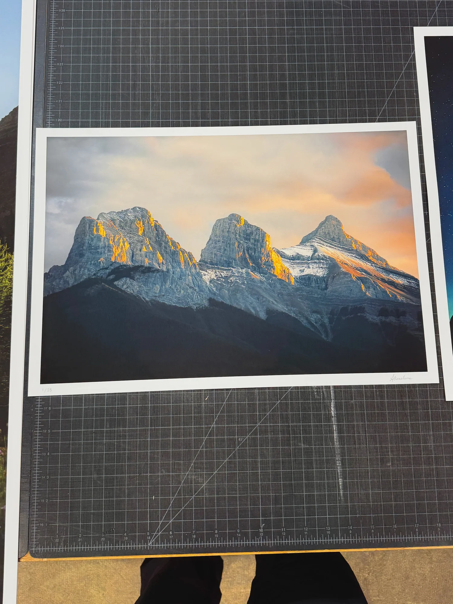
Do not skip this part! Test printing is the best thing you can do.
Comparing "Silver Lining" test prints from left to right: Opus house matte, Entrada Rag Natural and Canson Rag Photographique
When I was choosing a fine art paper, I realized pretty quickly that it’s not just about picking something “nice” or premium sounding. The paper massively impacts how a photograph feels in print and affects everything from the brightness to depth in the shadows, how it holds detail and ultimately the overall mood of the piece.
So I dove a little deeper on the elements worth considering in a paper:
Surface finish. Matte, satin, or glossy. This impacts the entire feel of the print. Gloss and satin papers usually have more shine and more visual punch, while matte papers feel softer and more like an art print.
Texture. Some fine art papers have a lot of texture, almost like watercolor paper, and others are very smooth. If you want the paper to add more character, texture can be beautiful; however, if you want to preserve image detail, a smoother paper is ideal.
Paper tone / whiteness. The base tone of the paper matters more than I expected. A brighter white paper can make an image feel cleaner, more luminous and cool toned, while a warmer paper can feel softer and more muted. Even highlights and neutral tones can shift depending on the paper base.
Shadow depth. This was a huge one for me. If your work depends on mood, contrast, and dark tones, you want a paper that can still hold richness in the blacks without everything falling flat. DMax describes how rich the darkest values can print, higher DMax = deeper shadows.
Cotton rag vs standard photo paper. Fine art papers made from cotton rag tend to have a more substantial, tactile, archival feel.
Archival qualities. Super 👏 important 👏. If you care about the longevity of your papers, you’re looking for certified acid-free, museum or also called archival grade.
Optical brightening agents. These are additives used to make paper appear brighter and cooler white under certain light. Less or no OBA isn’t bad, in fact it can give a more stable, natural white over time.
Weight. I think people put a lot of stock (get it… stock) in this, maybe more than needed at times. Higher weight isn’t necessarily better. For a larger size print you might want a heavier weight to prevent it from bending but otherwise 210 gsm can be just as premium.
Paper samples with key information on sizing and features.
Even before all that research, I knew I was looking for a paper that was i) museum quality, ii) acid-free to avoid degradation, iii) matte and iv) smooth.
So I test printed on three different stocks through Opus and brought them home: the Opus house matte, Entrada Rag Natural and Canson Rag Photographique. When I laid them all out, I had a gut feeling on one initially, but wanted to give it some time. So I occasionally moved them around, put them in different rooms, looked at them under different lighting over the next week. Our eyes recalibrate constantly depending on the ambient light and even just how the day is going, and I wanted to make sure I was choosing based on a consistent impression over time, not just a first reaction.
Turns out my gut had been right: Canson Rag Photographique was a clear winner. I learned in the process that it was specifically known for being an ideal choice for photographs: it had that smooth, velvety matte surface, the way it holds shadow detail (high DMax) and richness of the pigment depositing. It had the drama I was looking for in my fine art prints.
Choosing the images
This is a question I've gotten a lot: how do you decide which pieces to sell?
It's not a straightforward answer, because if you're an artist you know that some of the images you love most aren't necessarily the ones that resonate most broadly. I feel like it’s best to find a balance between the pieces that are most special to you and the ones that might connect with a wider audience. For me those two factors often intersected, which was reassuring.
To start I had four or five non-negotiables in my mind, pieces I had already decided would be in the collection. But ahead of finalizing the rest, I thought it might be a fun opportunity to get people involved. So I posted two sets of options on Instagram, one portrait orientation and one landscape, and asked people to vote on their favourites. I also figured it could be a cool opportunity for a giveaway, so included that every comment and share was also an entry to win one of the test prints…
"Light of Day", won the community vote and now one of my favourite prints in the collection.
I was honestly shocked at how many people connected and commented! And the best part was that one or two images I hadn't really planned on including got so much more love than I expected. And now one of them, “Light of Day”, is low-key one of my favourites in the whole collection. It came out so much more dramatic and stunning in print than I’d imagined, and I love that I hadn't even considered it before the vote. Really cool experience.
Curating the collection
Cohesion matters a lot to me: I like having a storyline and a visual thread across the pieces, a feeling that they belong together as a collection rather than being ten random favourites. I ended up choosing a set of five landscape and five portrait images. I wanted to offer a range of options and different orientations for people’s homes, but more importantly wanted them to feel like they’re from the same storyline, from colour to feeling.
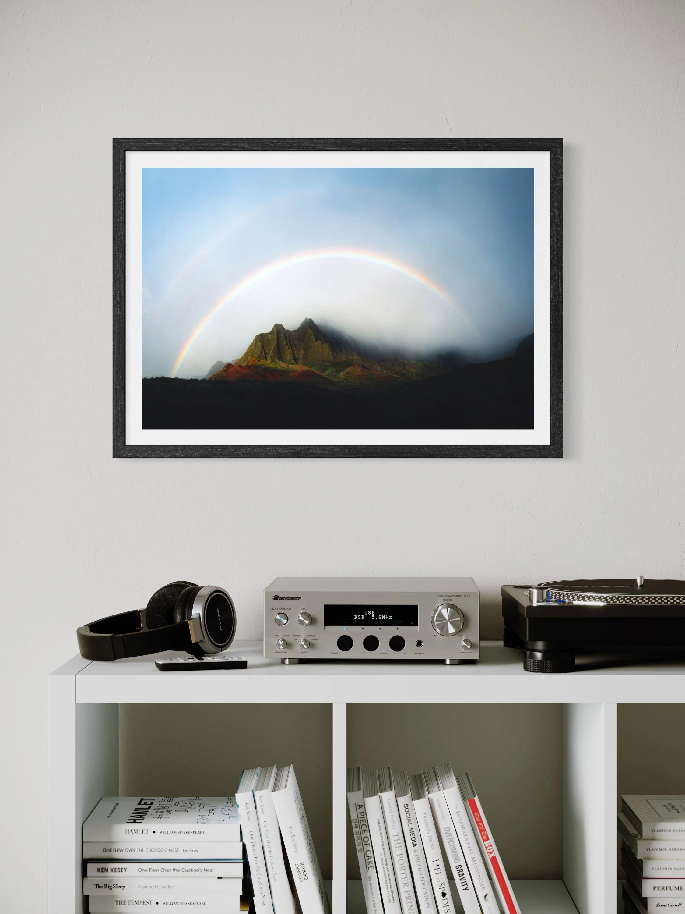
For sizing, I went with four options: 12x18, 16x24, 20x30, and 24x36, all in 2:3 format, which is how I shoot. The 12x18 felt like a more accessible entry point, and the 24x36 is a size I've ordered for my own home, so I knew the range felt right for different spaces and budgets.
What about framing? I definitely went back and forth on this one. Everyone has their own taste, their own home aesthetic and colour palette. It's really hard to offer even two simple framing options that would actually fit most people's spaces and feel as premium as the prints themselves. Plus, framed prints are significantly harder and riskier to ship. So I decided to leave framing up to the buyer to customize for their own space. The great thing about working with Opus is that they also offer custom framing, so if someone really wants that handled professionally, I can go to them and keep everything in one place.
Building the site and launching
Admittedly I had zero experience with ecommerce before this. On the positive, I had already built out my personal site on Squarespace prior to the launch, so it wasn’t too much of a learning curve to add the products and shop page. I’ve definitely added to it and expanded on the detail since, but at the start it was simple and clear for what I needed to do. It didn't take me nearly as long as I expected to set up, which was a genuine relief, but I will admit I was up late the night ahead of launch haha. I’d give myself a week to really work through and test the details if I did it again!
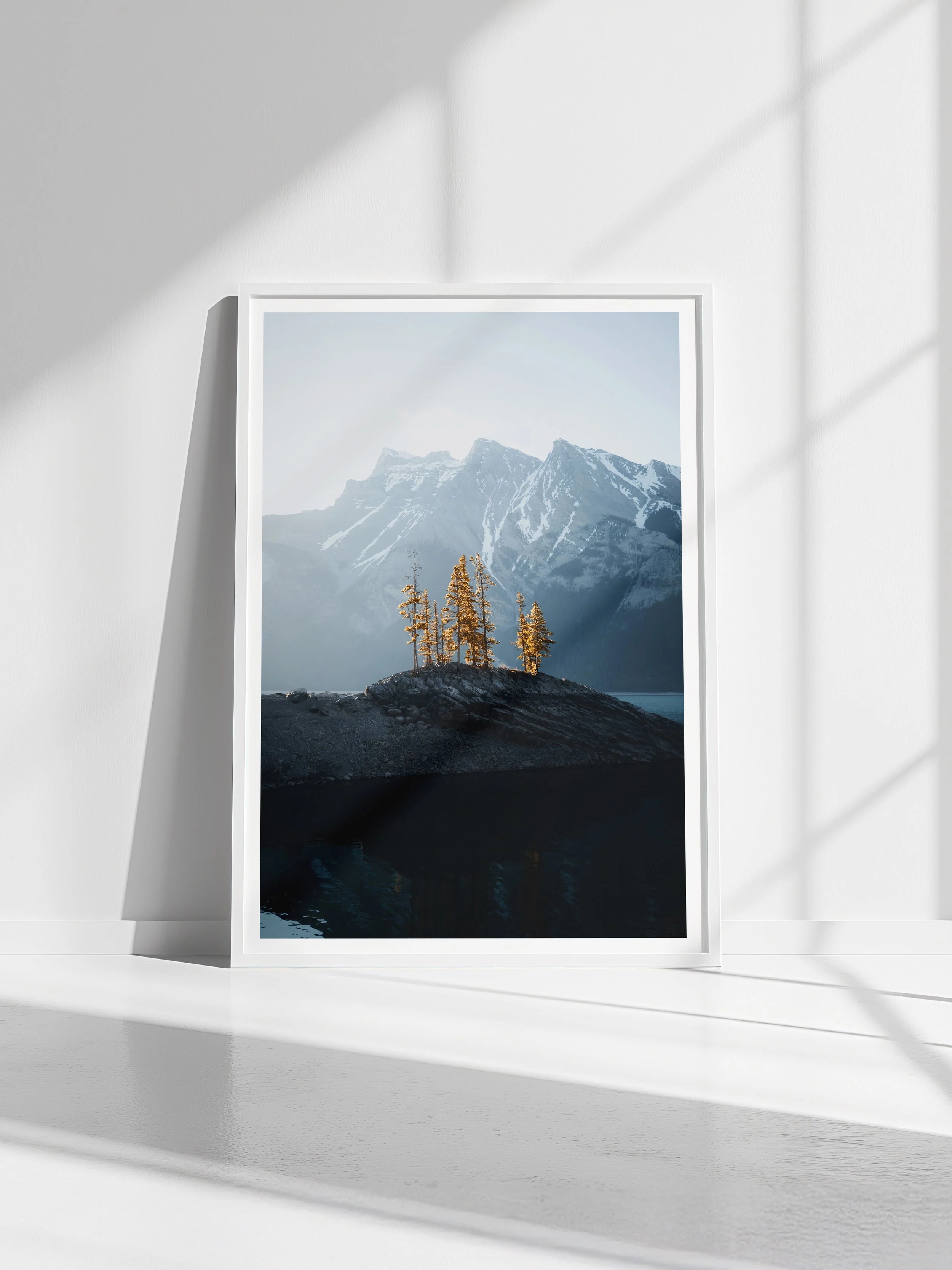
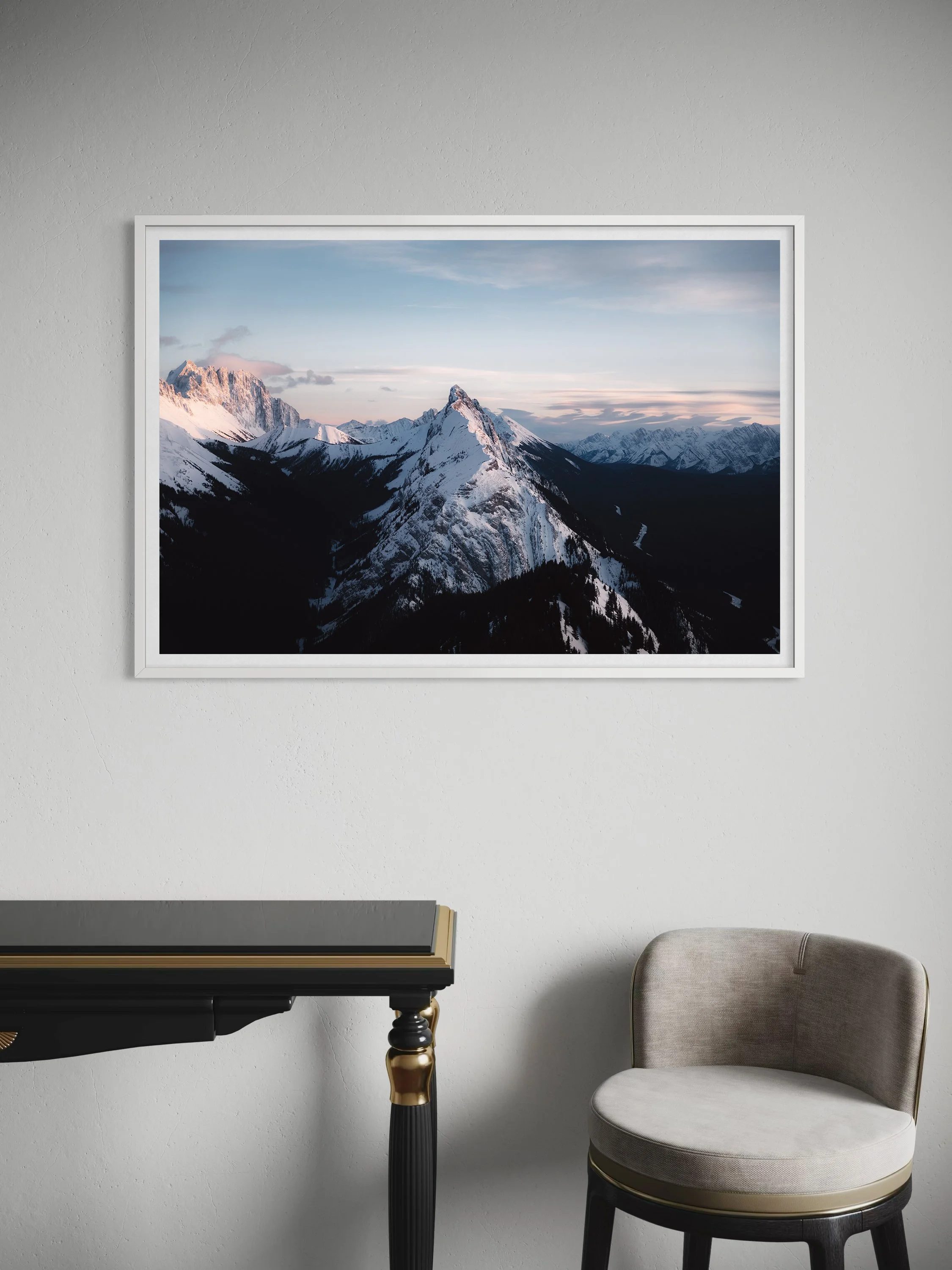
Another thing I'd highly recommend is using a mockup tool to show what your prints look like in actual rooms. I used Smartist and had quite a few buyers specifically mention how helpful those mockups were in helping them decide on sizing and visualize the work in their own space. It translates the art into something tangible in a way that a flat image on a white background just can't.
From vision to reality: signing the first orders
The launch day was wild. No matter how experienced you are, how many people engage with your work, you always wonder if things are actually going to turn out.
Were people actually going to buy my art? Did I make the pieces too limited or to expensive? Do people actually like my work enough to have it in their homes?
That all evaporated when the first orders came through. That feeling of seeing those emails, having people reach out about how excited they were to collect, was very very special.
Picking up and signing the first set of print orders. Over the moon!
So now it was time to actually print, sign, and ship that first round of orders. And I was scared again.
What if the colours were off? What if I'd sent the wrong files? What if the pieces looked terrible printed that large?
Okay, slightly overdramatic. But genuinely, scary stuff when you've never done it before and you're suddenly standing at the threshold of the thing you've been building toward for what felt like years. I remember nervously walking into the printers… and there they were. Some of the pieces were still coming through the printer (so cool!) and the rest were beautifully laid out on the table. The colours were gorgeous. Everything had gone right. I was stoked, relieved, and stoked again.
Signing the first batch of orders was when it stopped feeling like a dream and became a reality. These prints were in my hands, the quality I had worked toward, and soon they would be in people's homes. That moment of signing each piece, numbering them, knowing that someone had chosen that image for their wall... it's hard to describe the feeling. And then later getting excited messages from buyers, seeing photos of them hanging in living rooms and offices and being told how much they loved them, that made the whole thing worth every year of overthinking.
If you’ve also been putting off a print shop, this is your sign to finally do it.
The decisions are less scary than they seem once you actually name them. I spent years frozen because the whole thing felt like one massive, undefined problem. It wasn't. It was a series of smaller, very answerable questions, and once I started going through them one at a time, it came together faster than I expected.
A lot of what made the difference was committing to a philosophy first and then finding the logistics to match it. Not the other way around. Once I decided on format and quality, and a model that fit my actual life, the specific decisions about printers, paper and platforms all had a framework to land in.
If you have questions about any of this, or you're in the middle of figuring it out yourself, feel free to drop them in the comments or send me a DM on IG. I genuinely love talking about this stuff and I'm super happy to help where I can since I certainly wouldn’t have done this without the help of other artists who helped me talk through it!
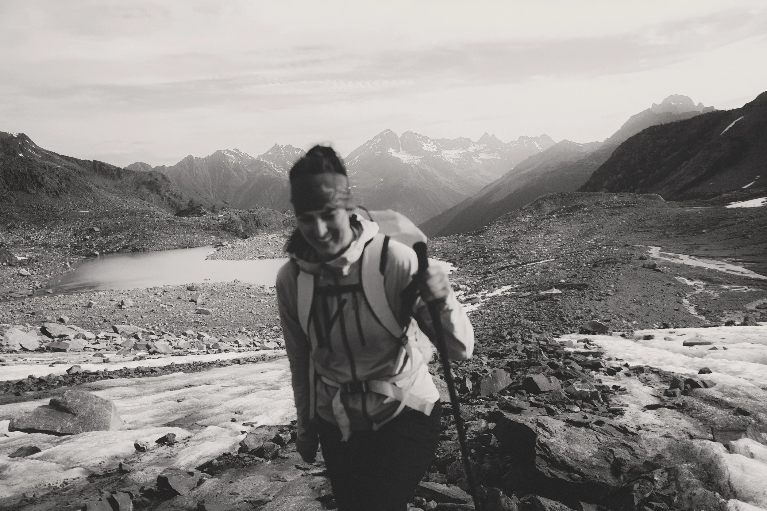
Alex Mack is a landscape and adventure photographer, ACMG apprentice hiking guide, and high altitude physiologist based in Vancouver, BC. She writes about mountains, photography, and the space where science meets adventure.
With appreciation that the lands known today as Canada are home to the enduring presence of all First Nations, Métis, and Inuit peoples. We acknowledge the past, present, and future generations of these Nations who continue to lead us in stewarding this land, and honour their knowledge and cultural ties to this place.